Project 3 min read
Falafel in Hotpot — Logo Design
Brand mark that transforms a food-suggestive name into a symbol of identity, harmony, and cultural exchange.
Overview #
Falafel in Hotpot is a cultural-bridging educational brand, and the logo needed to express that hybrid identity without collapsing into a literal food mark. Because the name naturally suggests food and beverage, the challenge was to build a symbol that could hold cultural meaning, character, and memorability beyond the obvious.
Challenge #
There was no formal brief, but there was a clear design problem: every early direction kept converging into something too culinary, too typographic, or too generic. A wordmark alone felt flat, initials lacked narrative depth, and any direct hotpot-or-falafel illustration reduced the brand to food instead of cultural exchange.
Concept #
The breakthrough came from personifying Falafel instead of illustrating falafel as food. The girl became Falafel — the brand owner reimagined as the face of the identity — while the enclosing circular shape was designed to serve two meanings at once: a hotpot seen from above and an ancient coin-like form.
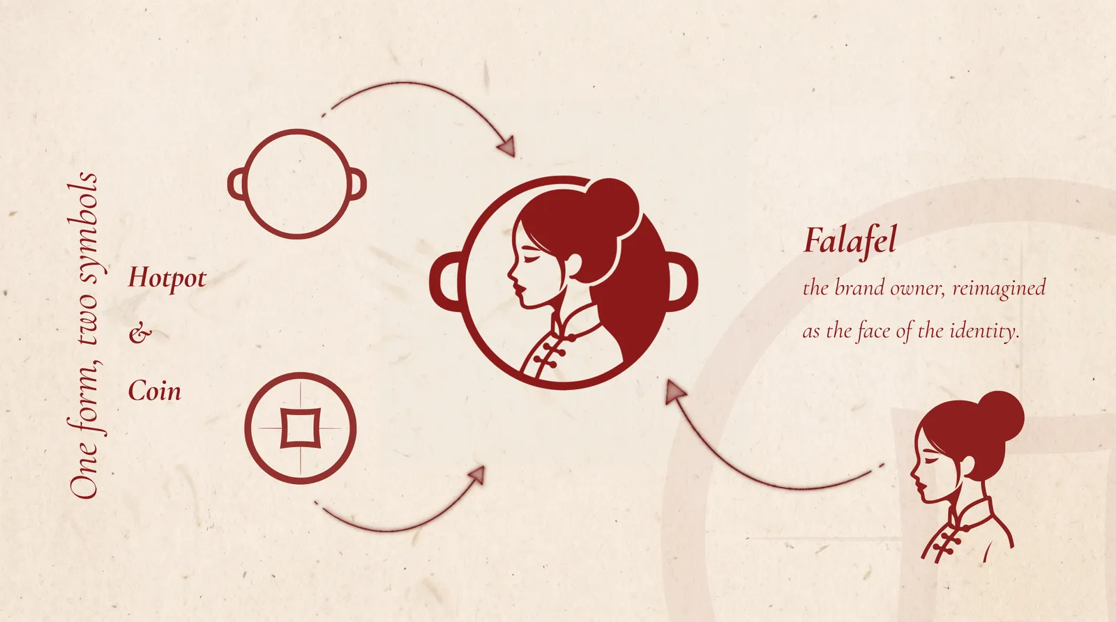
This allowed the mark to move away from food branding and toward something more symbolic. The final logo is not a literal scene; it is a compressed idea made from three source elements: Falafel, hotpot, and coin.
Symbolic Layers #
The logo was designed so that its meaning becomes richer as you look closer. The circular form carries both the vessel and coin reading, while the profile introduces a human face that gives the brand a narrator rather than an object.
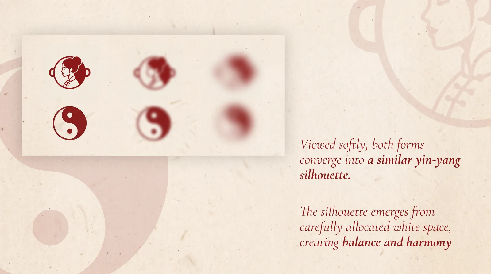
At the level of silhouette, the composition was shaped so that, when viewed softly, it converges into a yin-yang-like form. That relationship comes from carefully allocated white space, creating balance and harmony rather than relying on a literal yin-yang icon.
Direction #
The leftward gaze was also intentional. In the project narrative, it suggests a westward look from China toward the Middle East, reinforcing the brand’s role as a cultural bridge rather than a one-sided reference.
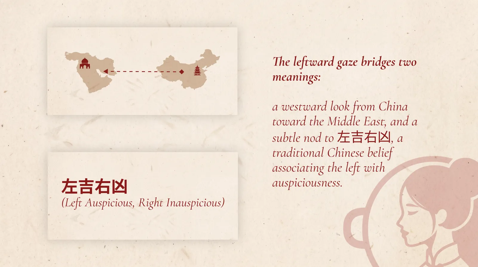
A secondary layer of meaning supports that choice as well: the left side carries an auspicious association in traditional Chinese belief, adding another cultural cue beneath the composition.
Character Design #
The character was designed to read clearly as Chinese rather than generically East Asian. That distinction mattered, because without specific visual cues the mark could easily drift into ambiguity.
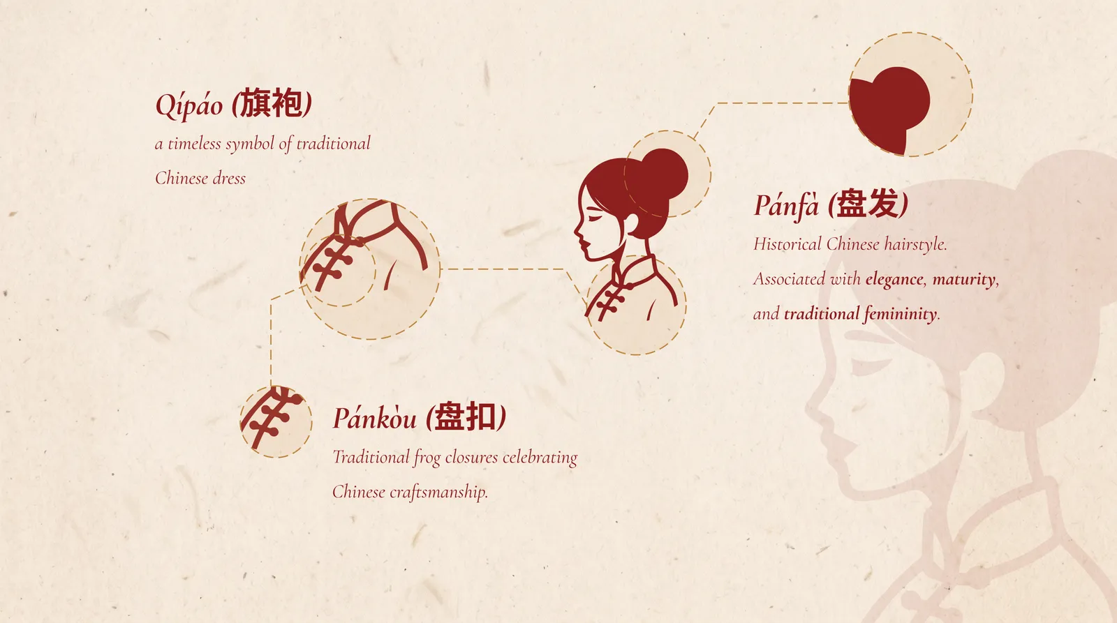
The qipao-inspired collar, the pankou closures, and the historical updo were all deliberate decisions. These details ground the logo in recognizable Chinese visual language while keeping the final mark minimal enough to remain iconic.
Color System #
The deep red draws from Chinese visual symbolism, while the warm beige introduces an Arabian reference that helps the logo sit between both worlds rather than belonging entirely to one.
Process #
The logo was developed through a high-volume AI-assisted exploration process using Grok image generation. Thousands of variations were explored across prompt refinements, compositions, silhouettes, and styling directions before the concept converged into a form strong enough to carry all of these meanings at once.
Once the final direction was selected, it was upscaled, traced in Inkscape, and converted into vector form. That SVG became the production master for the wider brand system, enabling clean exports across light, dark, and other asset variations.
Tradeoff #
The profile faces left for conceptual reasons, but logo placement on websites often happens in the top-left corner, which can make the mark appear to look away from the page. In this case, the symbolic narrative was strong enough to justify that tradeoff, so cultural meaning took priority over a stricter UI convention.
Outcome #
The final logo now functions as the visual face of Falafel in Hotpot across the brand system. Rather than illustrating the brand name literally, it transforms the name into a symbol of identity, harmony, and cultural exchange.